EcoEquitable
Role
UX Designer & Researcher
Time
2 Weeks
How might we increase the transparency of donations in order to make users feel more confident when donating to Eco Equitable?
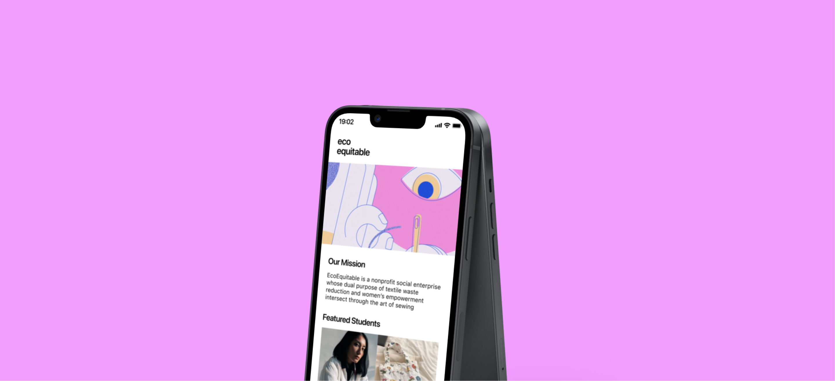
The problem space for this project focuses on the textile industry. The waste produced by the textile industry creates a serious economic and environmental concern. This was confirmed by my primary and secondary research. Throughout my interviews and research, I discovered that donation transparency was a major pain point for my users. This input permitted me to create a product for Eco Equitable, a non-profit organization located in Ottawa, that focuses on providing users with what they need while also decreasing fabric waste.
Interview Insights
Donors would prefer more clarity on the items they can and cannot donate, as well as alternatives to donating goods to make it easier.
Donors want to have easy access to information on organizations they may donate to so they can narrow down their decision quickly.
Donors want to see the tangible impact that their donations result in because this makes them feel assured and motivates them to continue supporting.
Jennifer Esther

About
Age 29
Family Single
Job Product Designer
Location Toronto
Jennifer is a Marketing Associate located in Toronto. She has a friend who volunteers with Eco-Equitable, and has been so moved by her friend’s passion for the Non-Profit. Donating and giving back always makes her smile, and fulfills her, she just wishes that the process didn’t make her work as hard.
“I feel a sense of satisfaction when I donate to charities, but it’s frustrating to not know where my donations are going. I want to make sure my donations are going to help people.”
Insights
Goals/Motivations
- Being able to get clear information on the donating procedures
- Feeling minimal effort to do the maximum amount of good
- Having visibility on the projects post the donation
- Wants to give back to her community
Frustrations
- Lack of clarity. It’s hard to know what donations are acceptable
- There are plenty of places to donate, she just doesn’t want to put the effort in
- Inconsistent drop-off centers
Behaviours
- Sets up auto payment for recurring donations
- Goes online to schedule and donate any goods
- Donates to a handful of organizations
Design Rationale
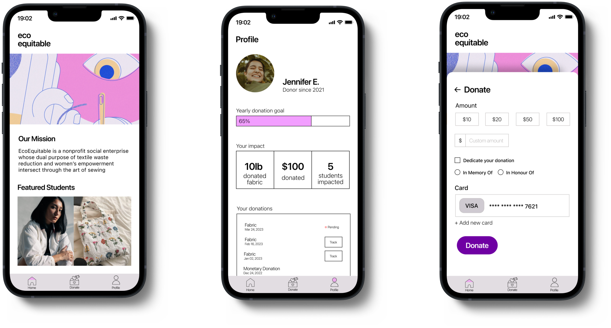
I included a yearly goal so the persona can have ownership over their contribution. Including personal impact lets the user know where their money is going and track their own donation habits.
I intentionally used overlay screens in order to minimize the feeling of one going from one to another as our overall goal was to make the donation experience less tedious.
When I was creating our screens, I built hi-fi and mid-fi screens simultaneously because I knew we wanted to use mid-fi screens for testing in order to get input about the logic behind my design instead of the look.

